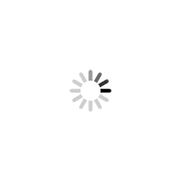
今天在這裡分享一個有意思的css3動畫效果,可以代替gif圖片,幸好有了css3的出現,不用圖片,挺好。有興趣的朋友可以看下演示和代碼,如下:
查看演示地址:http://tangjiusheng.com/css3/page02.html
代碼如下:
@-webkit-keyframes pan-ripple {
0% {-webkit-transform:scale(1);opacity:0;}
30% {-webkit-transform:scale(1.1);opacity:1;}
100% {-webkit-transform:scale(1.4);opacity:0;}
}
.wrap-ripple{z-index:99999;
position:fixed;width:50px;
height:50px;padding:8px;}
.wrap-ripple .s-ripple i {
position:absolute;
width:45px;
height:45px;
line-height:normal;
border-radius:50%;
border:1px solid #e60012;
box-sizing:border-box;
}
.wrap-ripple .ripple {
background:#e60012;
color:#f9e902;
font-size:13px;
text-align:center;
font-style:normal;
padding-top:13%;
opacity:.8;
}
.wrap-ripple .ripple-a {
opacity:0;
-webkit-transform:scale(1);
transform:scale(1);
-webkit-animation:pan-ripple 2s linear infinite;
animation:pan-ripple 2s linear infinite;
}
.wrap-ripple .ripple-b {
opacity:0;
-webkit-transform:scale(1);
transform:scale(1);
-webkit-animation:pan-ripple 1s linear infinite;
animation:pan-ripple 1s linear infinite;
}
.wrap-ripple .s-ripple {
z-index:99999;
width:50px;
height:50px;
display:block;
transform-origin: 0 0 0;
transform: scale(1, 1);
top: 40%;
right:15px;
}
點擊
諮詢
原文地址:http://tangjiusheng.com/css3/133.html
閱讀更多 湯久生前端 的文章


